Android tablets have been the butt of jokes for years now, and as much as I love the platform, I can’t disagree with most of the criticisms about its tablet experience. While most critics focus on the poor selection of tablet-optimized apps in Google Play, Android also fails tablet users in other key areas. For starters, there’s a dearth of premium hardware models, few decent input options, and subpar multitasking support. It doesn’t help that Google pretty much gave up on Android tablets years ago, leaving OEMs like Samsung to assume the mantle.
Device Management for Tablets
Yet even without Google at the helm, Android has been the leading operating system worldwide for tablets since Q4 2012, according to Statista. And thanks to the COVID-driven growth in work from home and online learning, Android tablets got a nice boost in shipments, so they’re more popular than they have been in years. The vast majority of those Android tablets have low-end hardware, though, so they don’t get a lot of buzz online.
Numbers of new tablets, Chrome OS devices, and phones launched in the last four years
# of new Android Tablet models1# of new Chrome OS device models2# of new Android phone models120219023315342020102120213420196753922712018630282470
1. Numbers were determined from the Google Play Console’s Device Catalog. Each entry was not vetted for accuracy, so the numbers may not be reflective of the actual number of new models launched each year.
2. Includes Chromebooks, Chomeblets, and Convertibles. Numbers were determined from Google’s “Developer Information for Chrome OS Devices” page which lists systems that ship from the factory with Chrome OS on them. All devices listed are assumed to be compatible with Android apps, which is true for all models launched in or after 2019.
Still, I think this data shows that the narrative that Android tablets are dead doesn’t hold water anymore. They’re alive and kicking, though without Google’s guiding hand, the experiences they offer are all over the place. Samsung has done a great job at patching up Android’s tablet shortcomings, but they’re just one OEM. Samsung doesn’t dictate what ends up in AOSP, and they don’t have the ability to tell other OEMs what they can and cannot do. Only Google has the power to make serious changes to Android, and fortunately, they’ve signaled that they’re going to take Android tablets a bit more seriously again.
In this week’s edition of Android Dessert Bites, I’m taking a look at all the things Google has done and is currently doing to improve the Android tablet experience.
Google's multi-step plan to improve tablet apps
Android tablets can run the same apps that Android smartphones can, but if those apps aren’t designed for larger screens, they’ll look and feel terrible. This isn’t just a problem for Android, mind you, but it’s more common on Android than it is on iPadOS.
When Google dropped Android Honeycomb in 2011, they didn’t really have a lot of the tools, documentation, and guidance that they offer today. Developers were just expected to optimize their app’s UI for larger screens by providing alternative layout resources, which required a lot of manual work. Don’t get me wrong, designing a UI that fits multiple screen sizes is still a big challenge, but there are a lot more resources available today to make that easier. For example, when Google introduced Material Design, they also published detailed guidance on best design practices, such as how to use density-independent pixels or vector graphics.
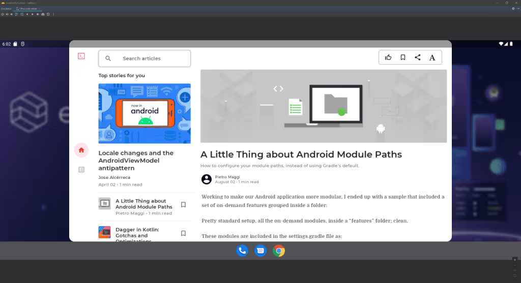
Besides better guidance on design, Google has also been introducing new platform APIs and support libraries to make it easier to design responsive UIs. Jetpack Compose made it easier to design layouts overall, while activity embedding in Android 12L lets apps show multiple activities at once. The latter makes it so developers won’t have to refactor their apps to implement a single activity structure accompanied by fragments, a practice that Google has been encouraging for years but recognizes is not widely employed.
Even if developers haven’t designed their apps for larger screens, though, Android’s native screen compatibility mode has gotten a major overhaul in Android 12L, with improved letterboxing to frame the app window in the best possible light. Android 12L also forces all apps to support split-screen mode, making support for one of the Android tablet’s most basic features more consistent. Device makers, meanwhile, can override an app’s preferred orientation in Android 12L, ensuring that all apps are oriented correctly.
Simply providing better tools won’t make developers do what they weren’t doing before, but Google is banking on a few things to entice developers to create better tablet apps.
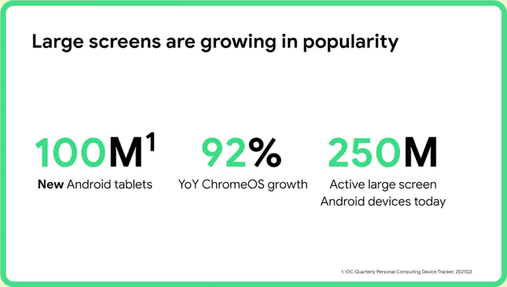
Most importantly, they’re hoping that developers see the way the wind is blowing. It’s not only tablets that have grown in popularity with the pandemic but also Chromebooks as well. Then there are foldable phones, which are projected to ship in massive numbers in the next few years. Tablets, Chromebooks, and foldables are obviously three different types of devices, but they’re all devices with large enough screens to accommodate multi-pane layouts. Developers can kill three birds with one stone by designing a responsive layout because it’ll adapt to fit tablets, Chromebooks, and foldables. Obviously, foldables (the non-clamshell type) are a bit trickier because of their adaptive form factors, so developers will need to use tools like Jetpack WindowManager to handle those state changes.
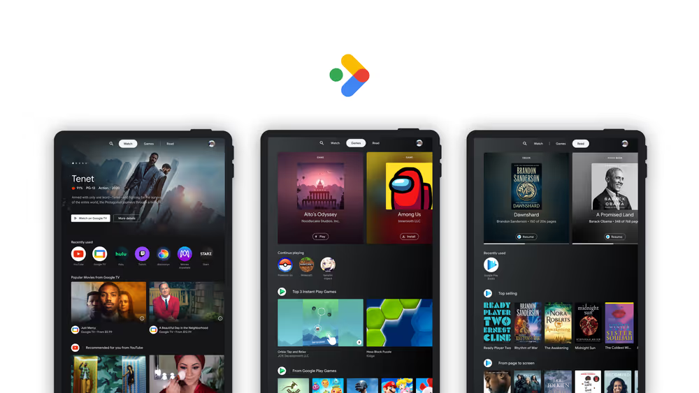
Google is also offering financial incentives to developers who design apps for larger screens, though only if those apps fall under certain categories. The Play Media Experience Program, for example, lets developers of book apps keep more of their revenue if they support tablet and foldable optimizations.
Finally, Google is making it easier for users to discover high-quality tablet apps. Google Play will start to show ratings specific to the user’s device, so tablet users will see reviews from other tablet users. Google’s Kids Space and Entertainment Space, meanwhile, act as content hubs for users to discover recommended apps among other media.

Righting the design wrongs of the past
While Android Honeycomb’s Tron-like UI was quickly supplanted by Holo in Android Ice Cream Sandwich, its tweaks to the notifications panel and recents overview stuck around. They didn’t last long, however, as Google decided to unify the navigation experience on phone and tablet in Android Jelly Bean. This, I feel, was a mistake. Android Jelly Bean’s change made tablets like the 10-inch Nexus 10 unwieldy. Unifying the design probably made sense from a development perspective, but it hurt the user experience. The general navigation experience has felt lacking ever since Android Ice Cream Sandwich.


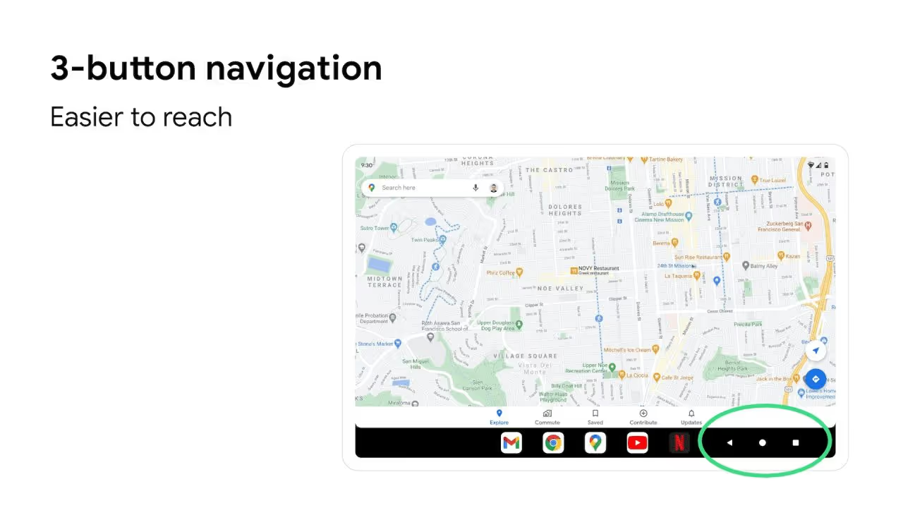
Android 12L, fortunately, takes the first major steps to right that wrong. It introduces a taskbar that unifies the navigation bar and the launcher’s dock. While navigation gestures remain unchanged with the taskbar enabled, the 3-button navigation is finally no longer centered. Instead, the center of the taskbar contains apps from the dock, which the user can quickly launch from any screen. Users can also long-press and then drag an app’s icon to launch that app in split-screen mode. While the taskbar doesn’t integrate with the status bar, a new swipe gesture introduced in Android 12 makes it easy to pull down the status bar on any screen.
Android 12L also fixes the navigation experience in other ways. For example, the recents overview has been tweaked to show the currently open app more prominently followed by the rest of the recently opened apps in two rows. With the new layout, you can see more of your recently opened apps. It’s also easier to access split-screen multitasking because the button is no longer tucked away behind the context menu that shows when long-pressing an app’s icon, at least for the app that’s shown first in the recents overview.
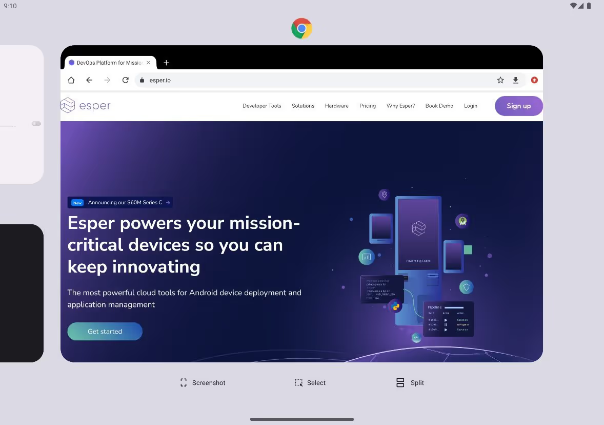
Speaking of split-screen, Android 12L also changed how it works under the hood. Apps are now “paired” together when they’re split-screened. The user can exit split-screen by pressing the home button and then reopen both apps in split-screen mode by tapping the app pair in the recents overview, saving the hassle of manually reentering split-screen mode.
There are a couple of other changes in Android 12L that demonstrate how Android is making better use of larger screens. The lock screen, notifications panel, and settings app now have dual-pane layouts. The keyguard, meanwhile, can shift its position based on where the user touches the screen.
Building a better tablet experience for everyone
Google’s large screen optimizations don’t end with Android 12L, of course. The next major release, Android 13, is already in developer preview, giving us a sneak peek at what’s in store for large screen devices. There aren’t many UI changes in the first DP, but there are a few things that I noticed. The taskbar, for example, now holds up to 6 app icons (up from 5), and I think it’s likely that Google will integrate the app drawer soon. The once empty space at the top of the keyguard is now taken up by a large user profile switcher, and the keyguard itself can finally be rotated.
While the first Android 13 DP doesn’t have any new user-facing tablet-related features, it does contain hints about some major changes that are coming. The first feature that I spotted is called “hub mode”, and it’ll supposedly let users share apps between profiles on a “common surface”. Profiles have their own apps and data, making it hard to use an Android tablet as a shared device while maintaining multiple profiles. Hub mode would solve this problem by letting users share apps between profiles so other users can access those apps without needing to borrow sign-in data or switch profiles. Users can even set up “trusted networks” that the device has to be connected to in order for hub mode to be active.
Hub mode is likely Google’s response to the growing number of tablets that are being shared in households. Samsung’s recently announced Home Hub tablet, for example, runs Android and is designed to sit on a dock and act as a shared device that everyone in the home can access.
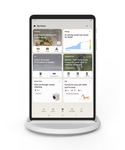
Android 13 may also improve the docked tablet experience in other ways, too. There are hints that the kernel will now recognize charging docks as a separate type of power supply, which may tie into new under-the-hood idle power saving behavior. More importantly, Android 13 DP1 includes code hinting at a major screen saver revamp. Google revisiting a feature they first introduced in Android Jelly Bean is a big deal, and I suspect it’s part of their plans to improve the tablet as a shared device.
Hub mode and screen saver complications are two of the bigger tablet-related features in development for Android 13, but they aren’t the only new features. The launcher app hints at a “kids mode” for the navigation bar, which will likely act like Android’s screen pinning feature in that it’ll lock the current task to the screen to prevent the child from exiting it. There’s also a new attribute that specifies whether an input method supports handwriting using a stylus, which will call a method whenever the ACTION_DOWN action is sent via a button press on the stylus. The input method can then show an inking window where the user can write using the stylus. Knowing Google, they probably plan to update Gboard to use this API in preparation for the launch of their rumored Pixel Notepad.
Finally, there’s gaming. Google hasn’t done anything to specifically improve gaming on tablets in Android 13 (yet), but their work in other areas will likely benefit tablets as well.
Back in January, Google launched Play Games for PC in beta, bringing a limited selection of Android games to PCs. It’s not hard to understand why Google decided to launch Play Games for PC. For one, they don’t want Microsoft and Amazon eating their lunch. It’s no secret that Google is incredibly proactive in maintaining its app store dominance, so there’s no way they’d let the Amazon Appstore be the only option on Windows. The mobile gaming market makes a ludicrous amount of money each year, making it even more important for them to contest Amazon in the PC space.
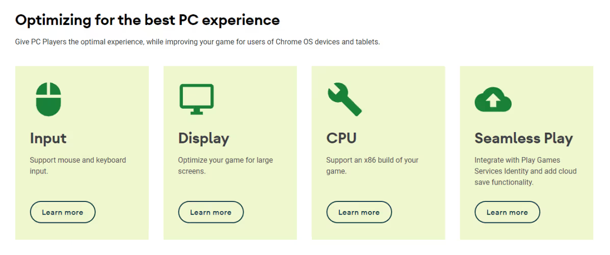
After launching the Play Games for PC beta, Google published some guidance on how to optimize Android games for the new platform. A lot of the tips make games better on not only PCs but also Chromebooks and tablets. Adding support for keyboard and touchpads will make it possible to play games on keyboard docked tablets without interacting with the screen, while optimizing the layout will improve the experience for all large screen devices. Better controller support, meanwhile, will make more games playable on dedicated Android gaming handhelds, which blur the line between smartphone and tablet. There aren’t many of these on the market right now, save for a few from companies like GPD and Ayn, but with the popularity of the (non-Android) Steam Deck and the recent announcement of the Snapdragon G3x Gen 1 Gaming Platform, I think we’ll be seeing more of these soon.
The rise of cloud gaming also benefits tablets, which have room for better speakers and bigger screens that are much more suited to displaying in-game text and other UI elements than phones do. A high-end tablet with an OLED display and quad speakers may even offer a better audiovisual experience than most laptops can, making it the best option for an on-the-go cloud gaming session.
When news spread that Google had spun up an Android tablet division, many people rolled their eyes since Google had already tried and failed to build a first-class tablet experience. But looking at everything they’ve prepared in the last few years and everything they’ve built in Android 12L and are building in Android 13, Google seems to actually have something here. There are still many things they need to improve, including the taskbar which lacks an app drawer, the desktop mode which lacks…everything, and the freeform multiwindow mode which is still hidden behind a developer option for some reason. Google may be launching its long-rumored foldable phone later this year, so there’s still plenty of time for them to fix many of these issues.
Even if they don’t, though, there’s always Samsung to turn to, who continues to churn out highly sought-after tablets with a slew of tablet-oriented software add-ons. Eying Samsung’s success, other major Android phone brands have ventured into the tablet market. OPPO recently released its first tablet, while OnePlus is rumored to join in. Realme launched its first tablet last year, while Xiaomi ended its hiatus from the market with the launch of the Xiaomi Pad 5 series. HMD Global, Motorola, and TCL recently launched various budget tablets. The tablet market isn’t as barren as it used to be, and with Google at the helm of software, it’ll hopefully stay that way.
Device Management for Tablets
FAQ
Keep Exploring
